
Semilla


Logo design for Semilla, juice cleanses.
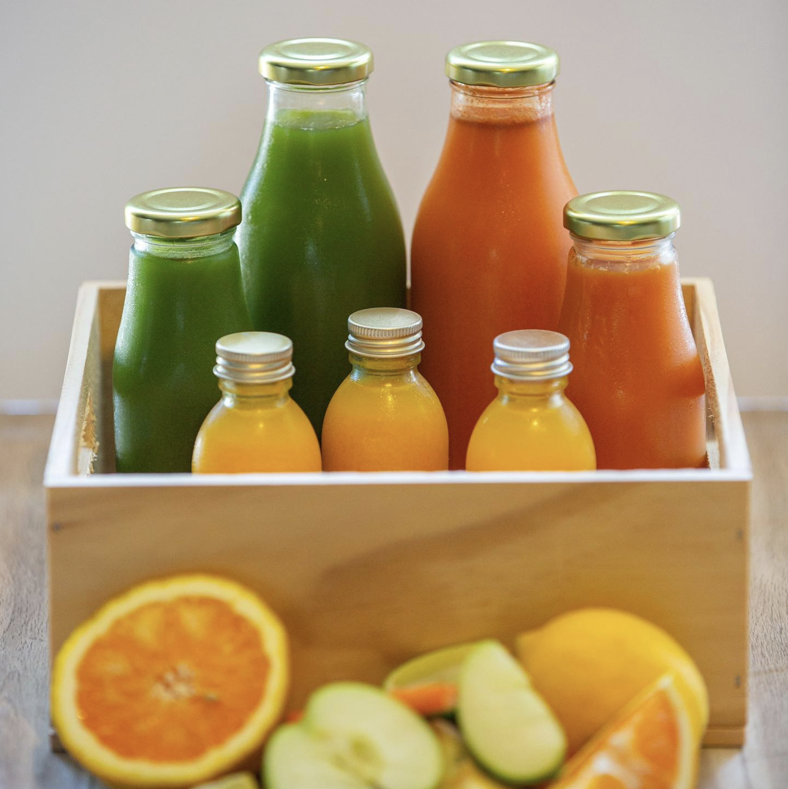
Planting seeds with beautiful intentions is where anything worthwhile begins, and that’s exactly what Pam has done with Semilla. Meaning “seed” in Spanish, Semilla is a reflection of Pam’s roots, both in her home country and in her deep passion for holistic health. She believes that life flourishes when your health does, and her carefully crafted cold-pressed juice cleanses are designed to help people reset, recharge, and thrive.
For this logo, I wanted to capture the essence of growth, renewal, and nourishment. The design features hand-drawn elements inspired by nature, symbolising transformation and vitality. The typography is clean and crisp, with an earthy colour palette, enhancing the feeling of purity and wellbeing, aligning with Semilla’s wholesome approach to wellness.
Beyond the design, I’ve had the pleasure of experiencing Pam’s juice cleanse firsthand, and it was exactly what my body needed. Her blends are delicious, thoughtfully crafted, and packed with goodness. She’s the kind of person you want in your corner when you need a reset!
It was an absolute joy to collaborate with Pam and bring Semilla’s visual identity to life.
Click here to follow Semilla.